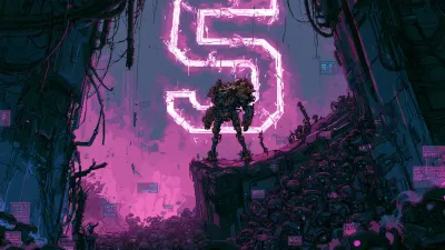
If you were on X in the week after June 9, you saw them: landing pages one-shotted from a sentence, a macOS-style web OS with a working terminal and a playable Minecraft clone in a single HTML file, a fully interactive 3D site built in 13 minutes. One “gave Fable 5 complete freedom to make a website about itself” post cleared half a million views. Meng To, who has spent a decade teaching designers, put it bluntly:
— Meng To (@MengTo), June 10, 2026Claude Fable 5 is a monster for creating landing pages.
The leaderboards agreed, for a while. At launch Fable 5 ranked #1 on Code Arena: Frontend in every sub-category, and #1 on Design Arena for UI components, SVG, and data visualization with a 67% tournament win rate. After the export-control drama, it even came back to fresh viral demos, recreating a polished reference site with rich motion from a single link.
So instead of writing about other people’s demos, I ran the experiment on the thing you’re reading. This site got redesigned by Fable 5, and this post is the writeup.
The demos are real, and they’re bait
Here’s what the viral posts get right: the one-shot ceiling genuinely moved. The macOS web OS thread wasn’t cherry-picking a hero section, it was a full environment generated “in one pass with almost no corrections.” That was not true of any model a year ago.
Here’s what they hide: a one-shot demo has no constraints. No existing brand, no legacy CSS, no user who has opinions about their own site. Every viral example starts from a blank file, which is exactly the situation where a strong house style looks like genius.
The skeptics noticed. Claire Vo asked Fable to one-shot a product design and got “gray, black, red, simple outlines,” her words: “not even AI-slop bad, fundamentally terrible design.” Michal Malewicz tested it on real client projects instead of hero sections and concluded the impressive part of the demos is precisely the part professional workflows don’t need. And the sharpest cut came from a Hacker News commenter on the launch thread: one-shot UI is “still ehhh,” but the model “can keep a design system together much better without veering off into random tailwind classes.”
That last take turned out to describe my week exactly.
What it actually did to this blog
This site has a written design doc: dark-only, cyan as the system accent, pixel-art chrome, a rule that glow effects are “earned, not sprayed” and a rule that the Press Start 2P display font is for tiny chrome labels only.
The first thing Fable 5 produced was not a redesign. It was a charge sheet. The site was violating its own documented system:
- Tri-color gradient buttons and rotated ribbon badges, in a system whose doc explicitly bans gradient decoration
- Glow sprayed on list bullets and metadata, where the doc reserves glow for active states
- The pixel font rendered at 3rem in the hero, where the doc caps it at chrome-label sizes
- Three identical card grids where the doc promises hierarchy
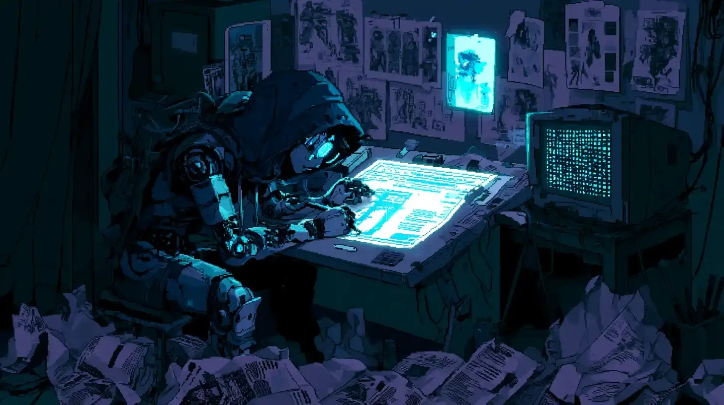
The redesign that followed was maybe 60% enforcement of rules I had already written, and 40% committed new moves: the stock-image hero became a generative canvas of drifting phosphor dots that react to your cursor, the uniform card grid became a numbered ledger (the homepage now indexes posts POST_213-style), status ribbons became inline terminal flags, and section headings picked up mono counters.
An experiment that made the rounds after Fable’s launch: someone loaded Fable 5’s leaked system prompt into Opus 4.8 and ran the same landing-page prompt on both. The outputs diverged completely: branding, voice, structure. A meaningful chunk of “model taste” is instructions, not weights. Which means the version you control, a design doc in your own repo, is not optional garnish. It’s the difference between getting your site back and getting the house style.
What Fable 5 doesn’t solve
- The house style has gravity. Charlie Hills’ critique of Claude design holds: left alone, you get “the purple gradient, the Inter font and the identical bento cards.” My redesign avoided that only because the identity was written down and defended. Blank-slate output converges.
- One-shot quality is bimodal. The same model that one-shots a stunning 3D site gave Claire Vo something she called fundamentally terrible. Demos on X are survivorship bias with an engagement graph.
- The crown moved in three weeks. GLM-5.2 took the Design Arena website leaderboard by late June at roughly a tenth of Fable’s price. Aesthetic leaderboards are a treadmill, not a moat.
- Verification is still yours. It screenshotted and checked the desktop build itself; the mobile breakpoints shipped on code review alone. A human still owns the QA loop.
- You might not even be talking to it. Post-relaunch, flagged requests silently reroute to Opus 4.8. Some fraction of “Fable 5 designed this” posts are now, unknowably, Opus posts.
The actual lesson
The viral framing is “AI can design now.” The useful framing is narrower: this generation of models can hold a design system in its head and apply it with a consistency that tired humans don’t. Taste, in the sense that matters for a real site with a real identity, was never going to arrive in the weights. It arrives in the constraints you write down and the model’s newfound ability to respect them, point out where you don’t, and occasionally push one committed idea past where you’d have stopped.
The phosphor field behind the title above you is the model’s idea. The rules that kept it cyan instead of purple-gradient are mine. That split, I think, is the durable shape of this.
Related Posts